The Two-Shade Wall: Petals, Flight and Depth
Most walls in a home are asked to do very little. They hold up a clock, take a coat of paint every few years, and otherwise stay quiet. But there is one wall in almost every room that people's eyes land on first, and that wall can carry a whole idea if you let it.The idea worth borrowing right now is a simple one: pick two shades, then decide what those two shades are doing. Blooming, flying, or pushing forward off the surface. Three different moods, one restrained palette. Here is how each of them plays out.
Start with two shades, not ten
The fastest way to make a wall look considered rather than busy is to limit the palette before you limit anything else. Two shades give you contrast without noise, and they give the rest of the room something to answer to.
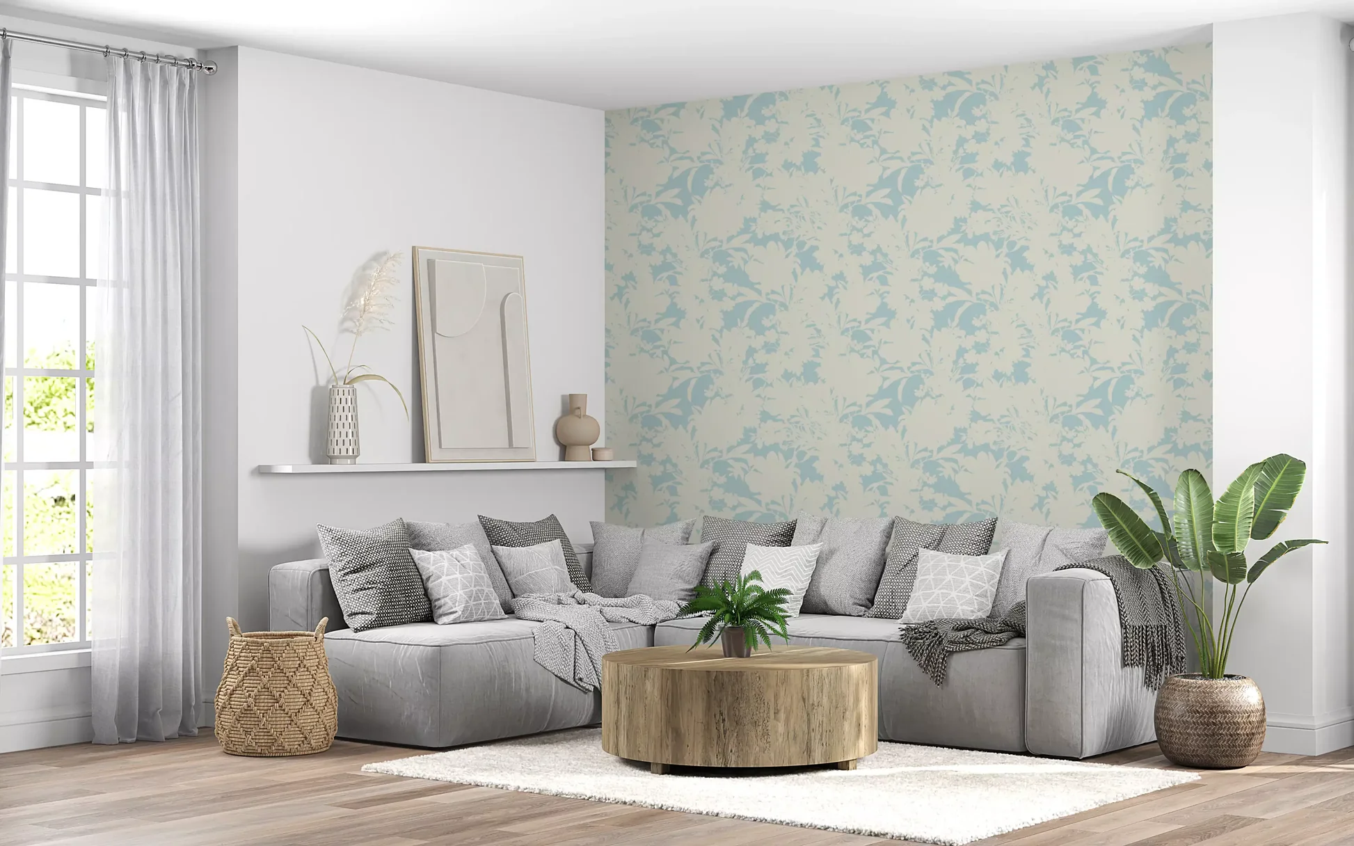
A design like the Airy Cream and Blue Garden Repeat shows how far a pair of tones can stretch. Soft floral silhouettes sit on a pale cream ground in a single dusty blue, and because nothing competes, the pattern reads as texture from across the room and as detail up close. Two-tone works particularly well in rooms with a lot of natural light, where a heavier multicolour repeat can start to feel loud by mid-afternoon.
This restraint is one reason botanical prints flower wall coverings keep returning to the two-shade formula. The subject matter is already complex, so the palette does not need to be.If you want to browse this way from the start, the full double colour wallpaper range is sorted by shade, which makes it easy to build outward from whatever you have already committed to in the room.
Petals: deep blue against near-black
Dark florals are having a long moment, and the reason is practical as much as visual. A pale floral asks the room to stay pale with it. A dark one does the opposite. It anchors everything else and lets your furniture be lighter, warmer, more relaxed.
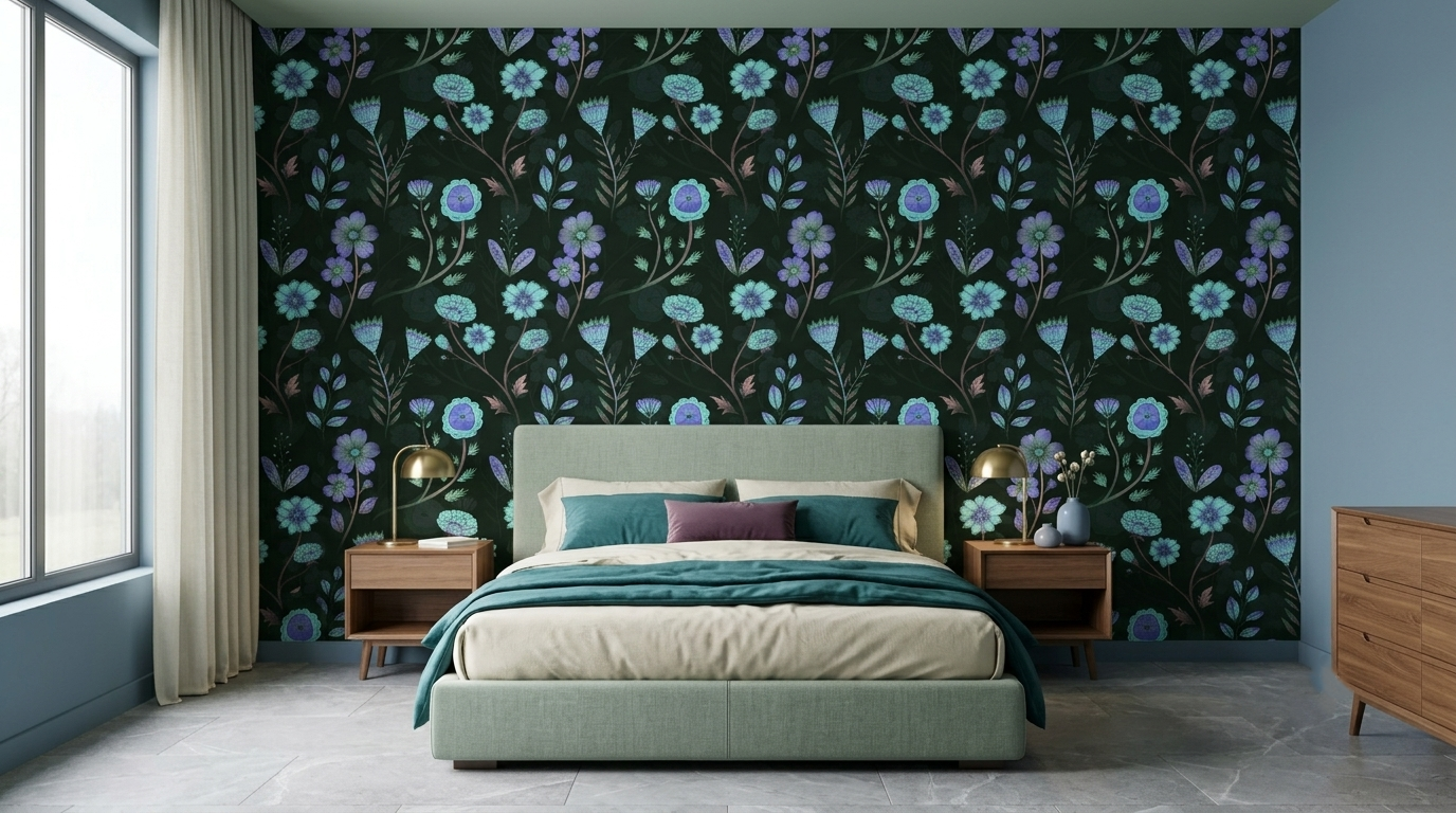
The Luminous Floral Whispers is a good example of the type. Blue, teal and violet blooms glow against a deep black ground, and the contrast between the two is sharp enough that the flowers seem to catch light even at a distance. This is the kind of wall that looks best behind something solid, a bed or a sofa, where the dark field can act as a backdrop rather than the whole story.
A word of caution: dark walls eat light. If your room only gets an hour or two of direct sun, put the dark floral on the wall facing the window rather than the one beside it. The reflected light will do most of the work.
The wider black and blue flower wallpaper range runs from these moody botanicals to much softer painterly repeats, so it is worth filtering by colour before you filter by anything else. If the inky version feels heavier than your room can carry, a watercolor flower wallpaper in the same blue family gives you the shade without the weight, since the bleeding edges keep the pattern from reading as solid. Either way, floral wallpaper rewards a decision made about tone first and motif second.
Flight: yellow that earns its brightness
Yellow is the shade people avoid because they have seen it done badly. Used across a whole wall at full saturation, it is exhausting. Used as the smaller half of a two-shade pairing, it does something no other colour manages, which is to look like light rather than paint.
That is exactly the trick in butterfly wallpaper yellow designs, where golden wings scatter across a green botanical field. The yellow appears in small amounts, repeated, so your eye travels rather than settles. The green does the heavy lifting and the gold provides the movement.
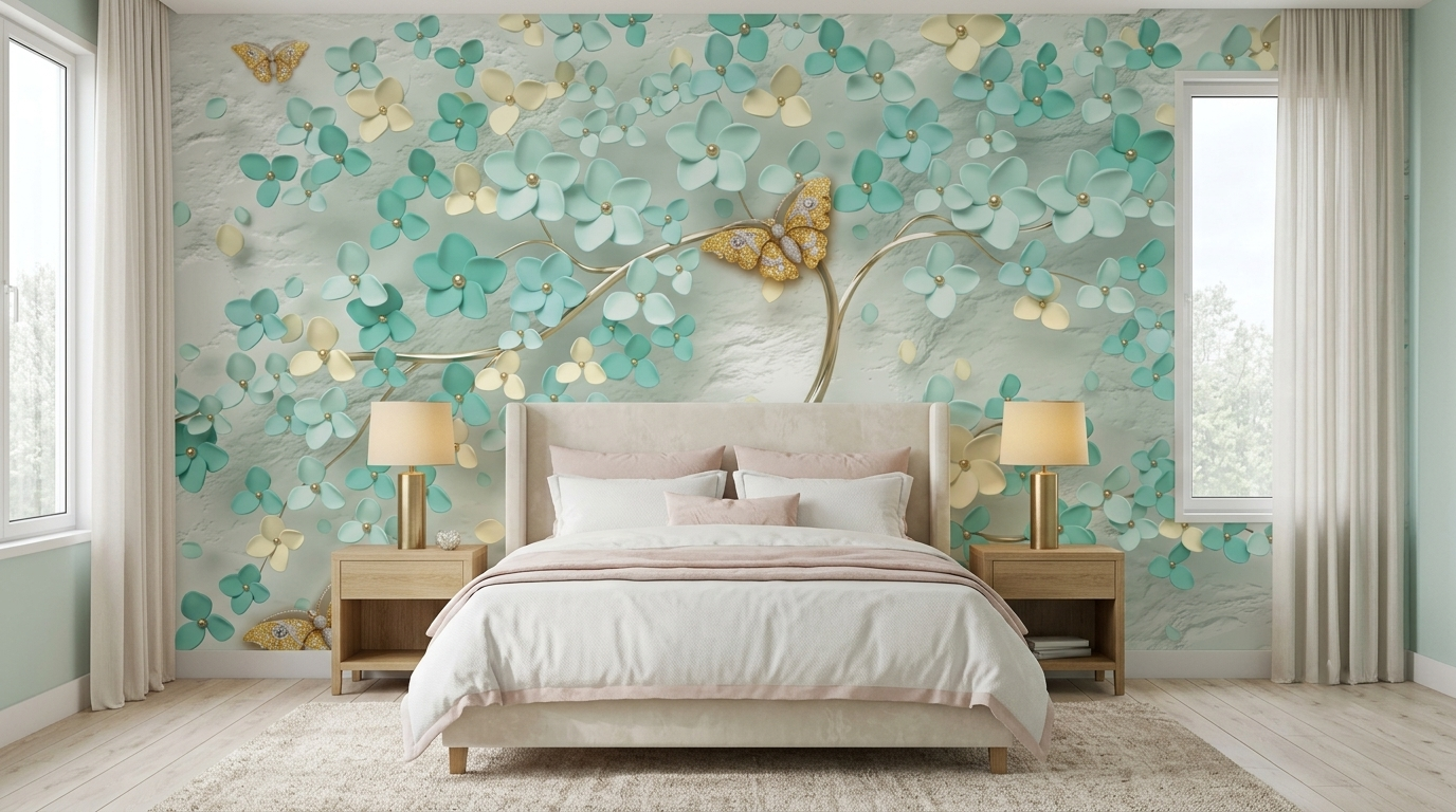
This works beautifully in rooms where people pass through rather than sit still. Hallways, stairwell landings, the wall you see from the front door. The pattern rewards a glance more than a long stare, which is the right quality for a space nobody lingers in.
If the botanical direction appeals, this piece on tropical wallpaper ideas goes further into leaf-led schemes and how to keep them from feeling like a holiday brochure.
Depth: red, black and the illusion of a third dimension
The last mood is the boldest, and the one that changes a room's proportions rather than just its colour. Dimensional patterns use shading and geometry to suggest that the surface is not flat at all, and in the right room they genuinely alter how large the space feels.
Red against black is the classic pairing for this because the tonal gap between them is enormous. The eye reads the red as advancing and the black as receding, and the pattern appears to have real relief.
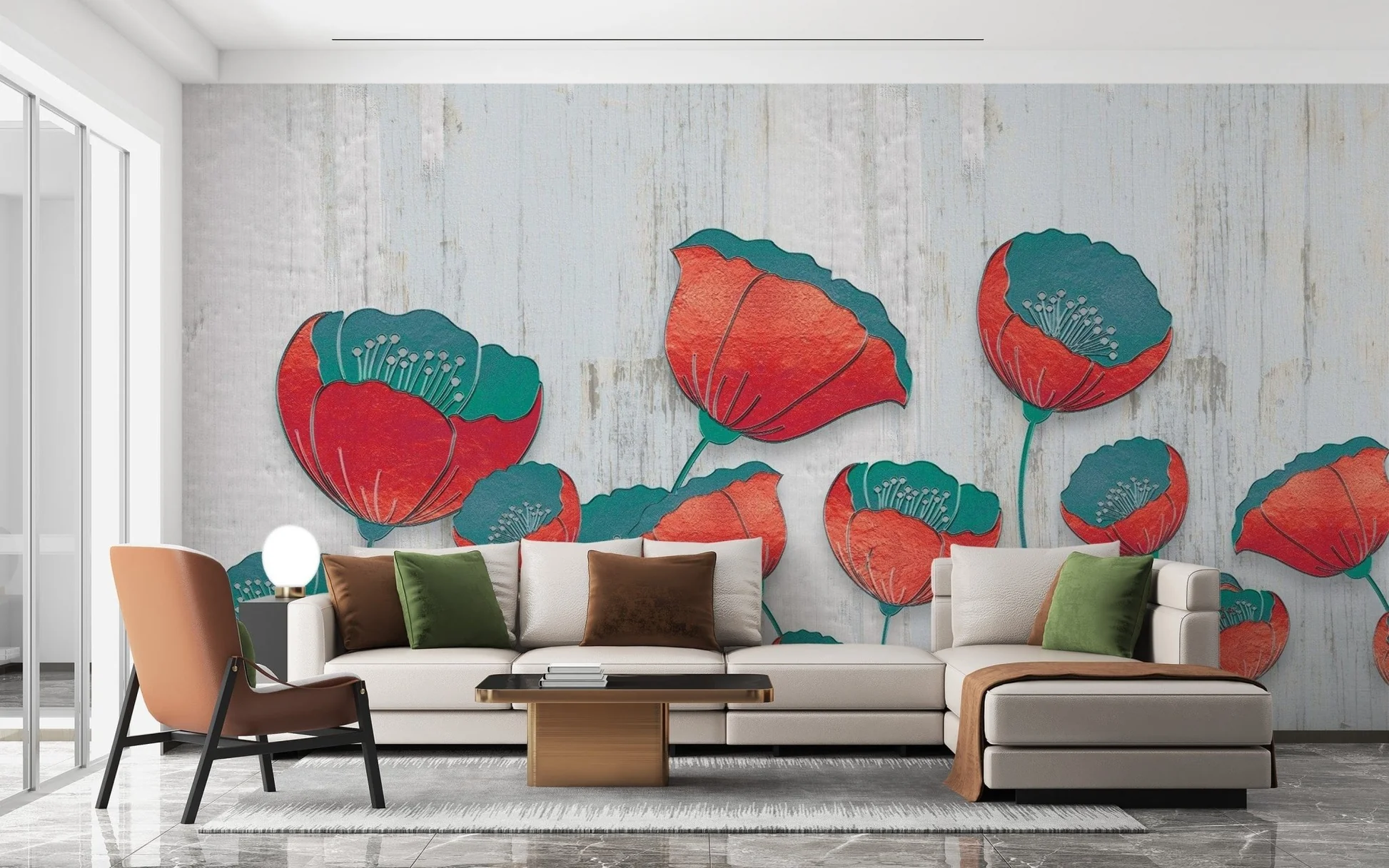
A piece like the Blooming 3D Red Floral sets deep crimson blooms against a dark ground, and the shadow between the petals is what sells the illusion of depth. The wider red and black 3d wallpaper range covers geometric mosaics, layered panels, and softer curved forms too, so the intensity is yours to dial up or down.
One rule holds across all of them. Dimensional patterns need a plain wall opposite them. Give the illusion room to breathe and it reads as clever. Surround it with more pattern and it reads as chaos.
Choosing between the three
Blooming, flying, or advancing. That is really the whole decision. Petals for rooms where you want warmth and stillness, wings for rooms you move through, depth for rooms that need to feel bigger than they are. Pick two shades, pick one behaviour, and the wall stops being a surface and starts being a choice.
FAQs
Does a two-shade wall covering suit a small room?
Yes, and often better than a multicolour one. Fewer tones mean fewer visual breaks, so the eye reads the wall as a single plane rather than a patchwork. Keep the lighter of the two shades as the background and the room will feel wider than it measures.
Will a dark blue and black floral make a room feel closed in?
Only if it is placed on the wrong wall. Put it on the surface facing your main light source rather than beside it, and the reflected light keeps the pattern open. Pairing it with pale flooring or light seating also stops the darkness from wrapping the whole room.
How do watercolour patterns differ from sharper botanical repeats?
Watercolour edges bleed into the background, so the pattern reads as a soft wash from a distance. Sharper repeats hold their outlines and stay legible across the room. Choose the softer version when you want atmosphere and the crisper one when you want the motif itself to be the feature.
Can I use a dimensional pattern in a room that already has texture?
It is possible, but keep the competing textures on horizontal surfaces rather than vertical ones. Rugs and upholstery sit below eye level and will not fight the wall. Exposed brick or panelling on an adjacent wall usually will.
Which of the three moods works best in a hallway?
The winged, scattered patterns. Hallways are seen in motion and at an angle, so a design with repeated small points of interest holds up better than one built around a single large focal point.